Humana Health & Wellness Portal
Humana engaged SapientNitro to redesign their rewards-based health and wellness portal, Go365. Throughout weekly sprints, I used competitor analysis, journey ideation, concept sketching, prototyping, focus group testing and refining to redefine the platform from a human-centered design perspective.

MY PART
UX Research | Stakeholder Workshops | Journey Mapping | Competitor Analysis | Wireframes | User Flows | Prototypes | Presentation Design
TOOLS USED
Photoshop, Illustrator, InVision, Google Slides
PROJECT DURATION
6 weeks
The Problem
Humana’s rebrand of HumanaVitality to Go365 created a need to replace fragmented legacy experiences with a unified design system and web application that consolidated content and interfaces. The redesign needed to clearly communicate the task based rewards journey and member benefits to lift engagement and retention.
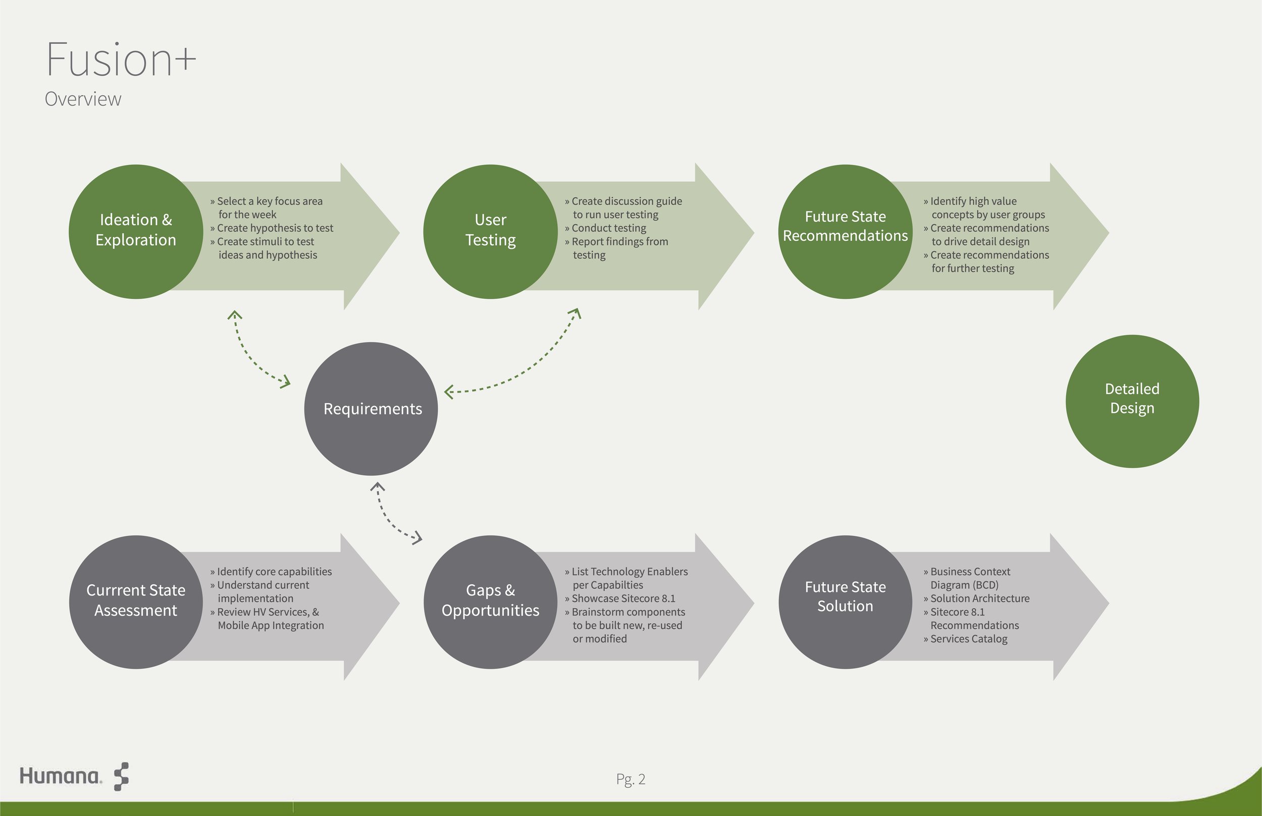
Six Weekly Sprints
The weekly sprints included immersion, three product design categories, summarizing & validation, and design planning.

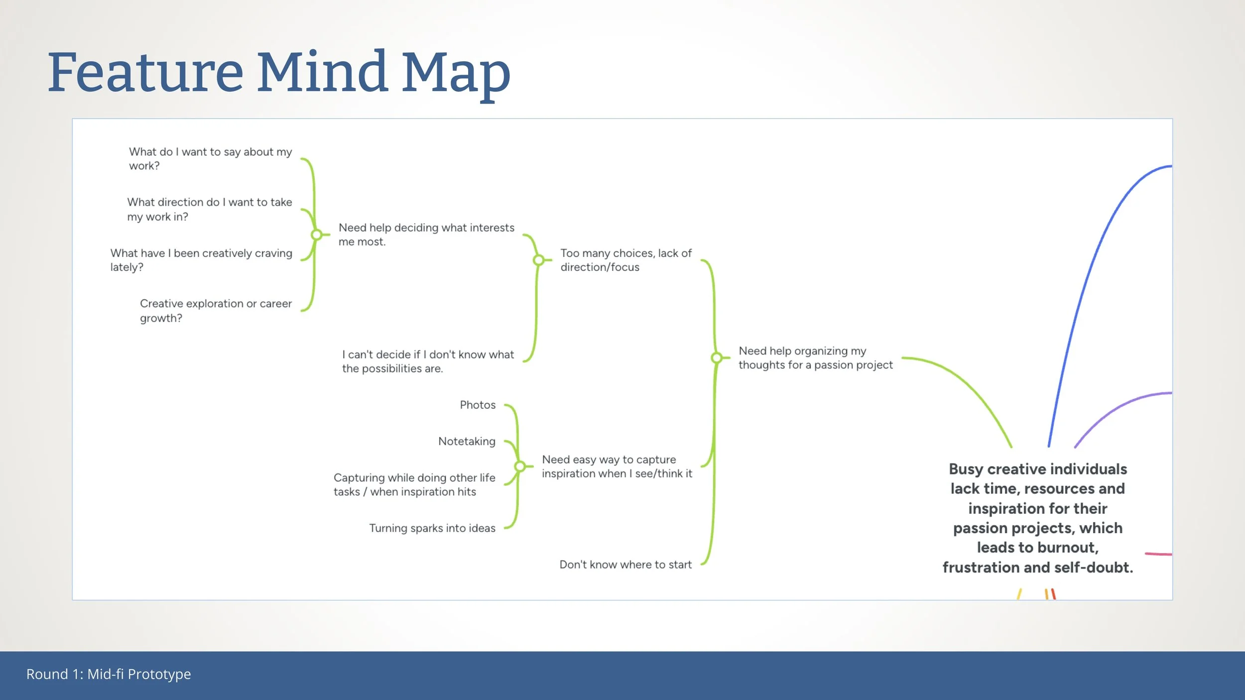
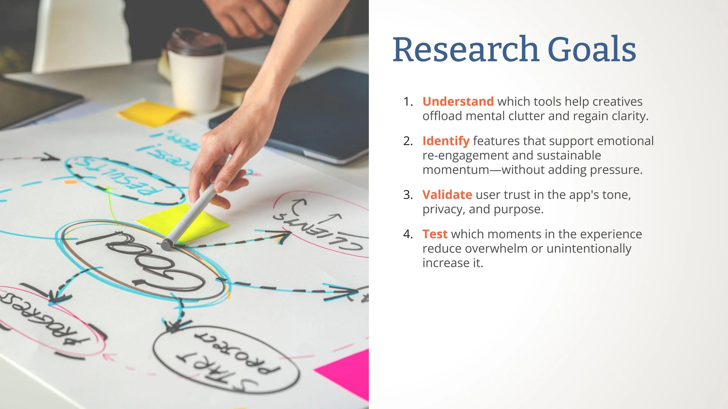
Research Findings
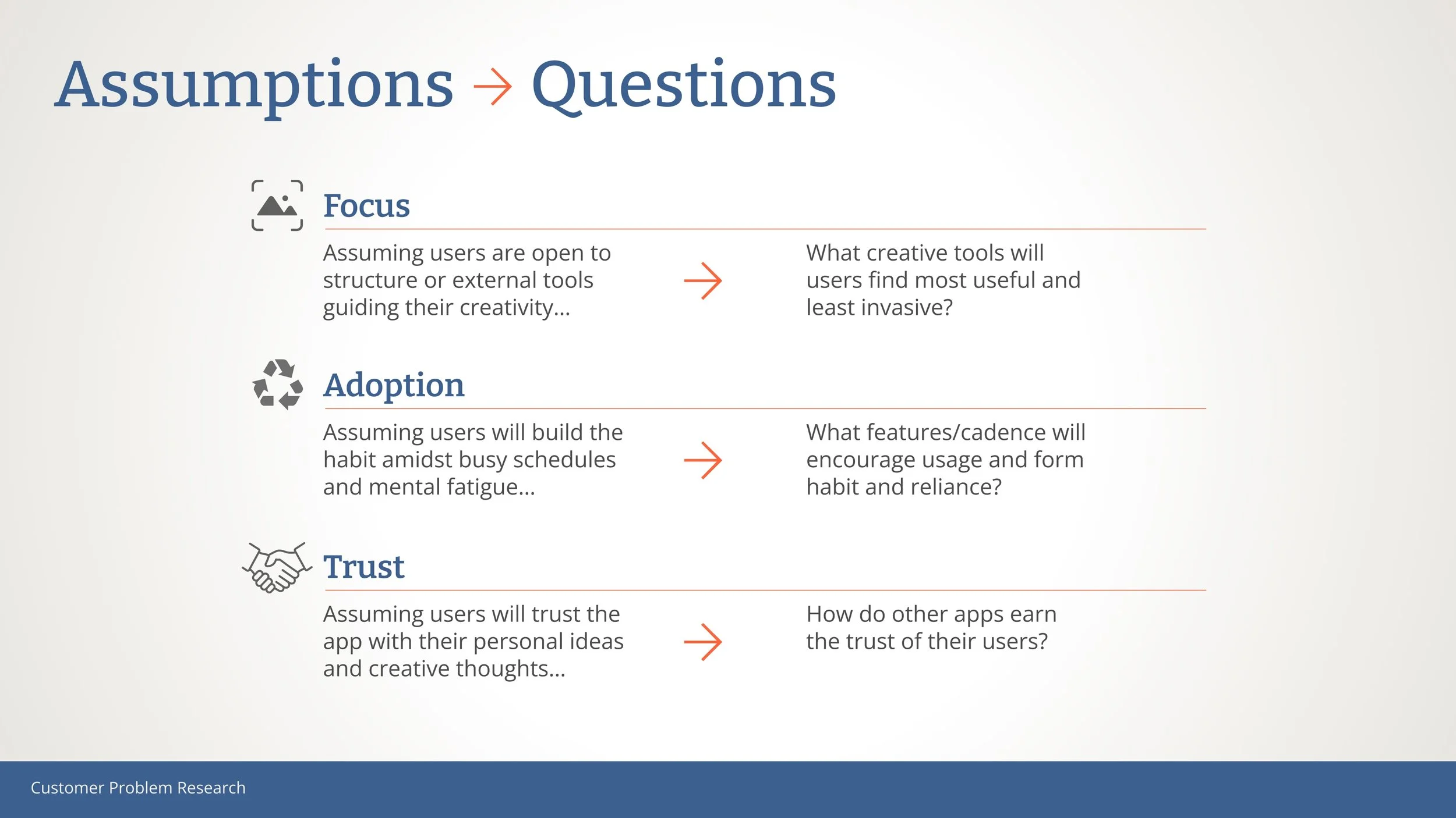
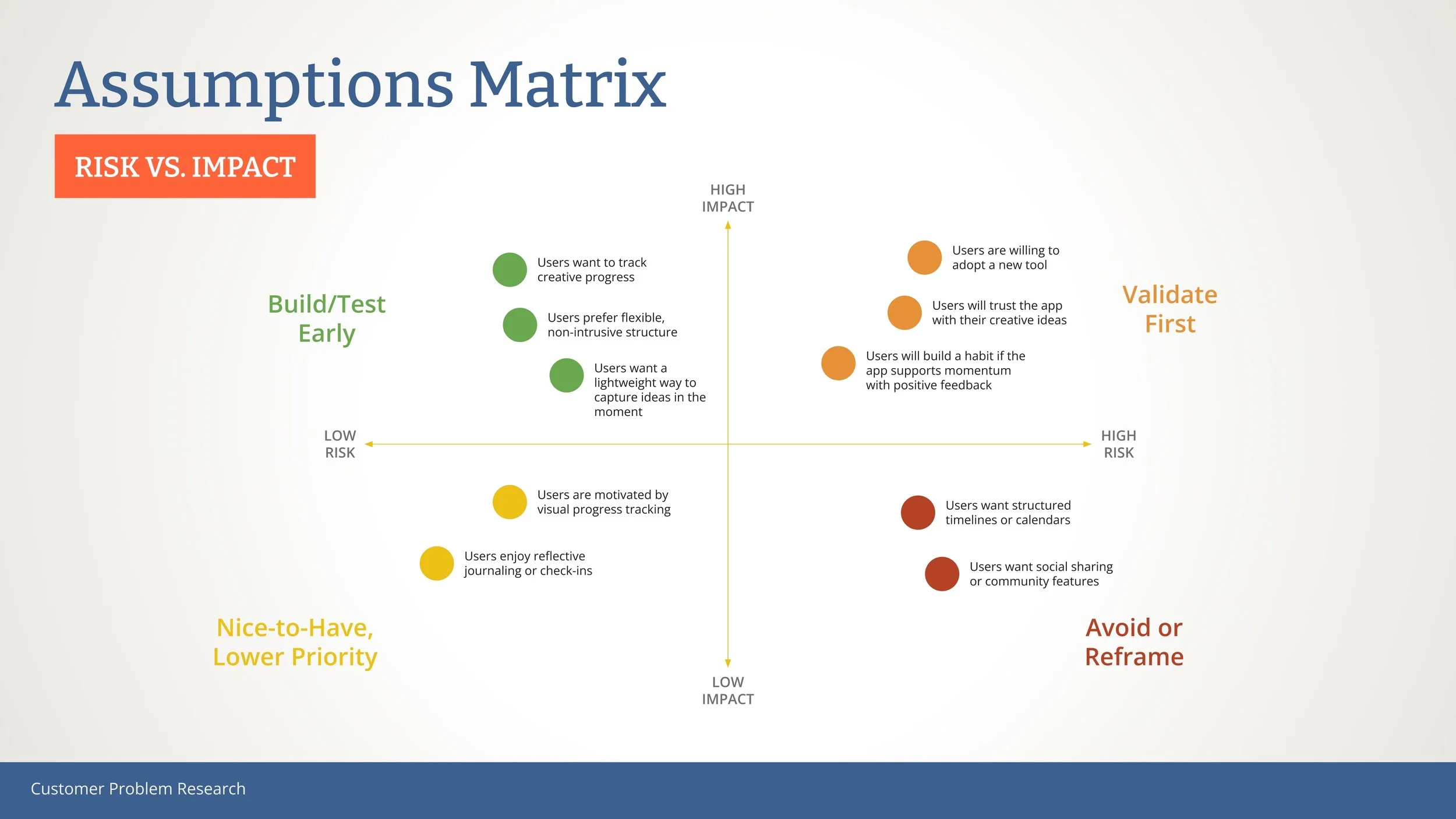
All four interviewees indicated that time constraints, perfectionism, and fear of failure were the leading causes of their passion project stagnancy. Based on this validation, I created a Risk vs. Impact grid to prioritize features to be considered for prototype testing.


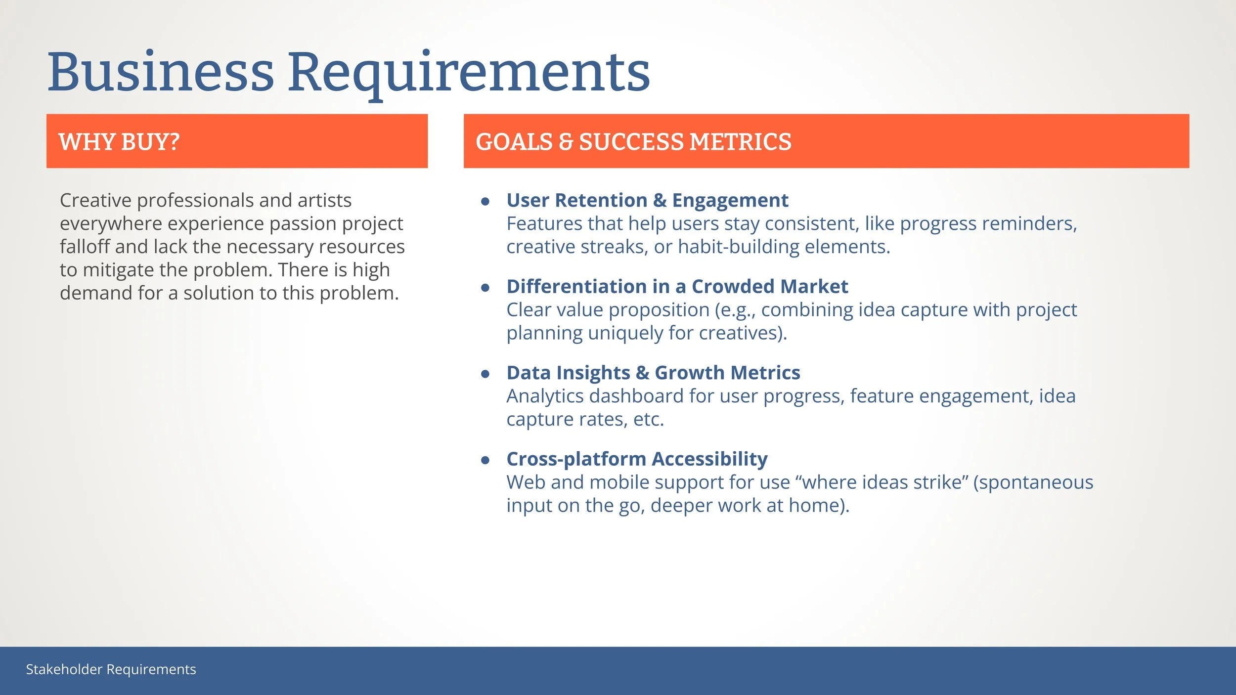
Stakeholder Requirements
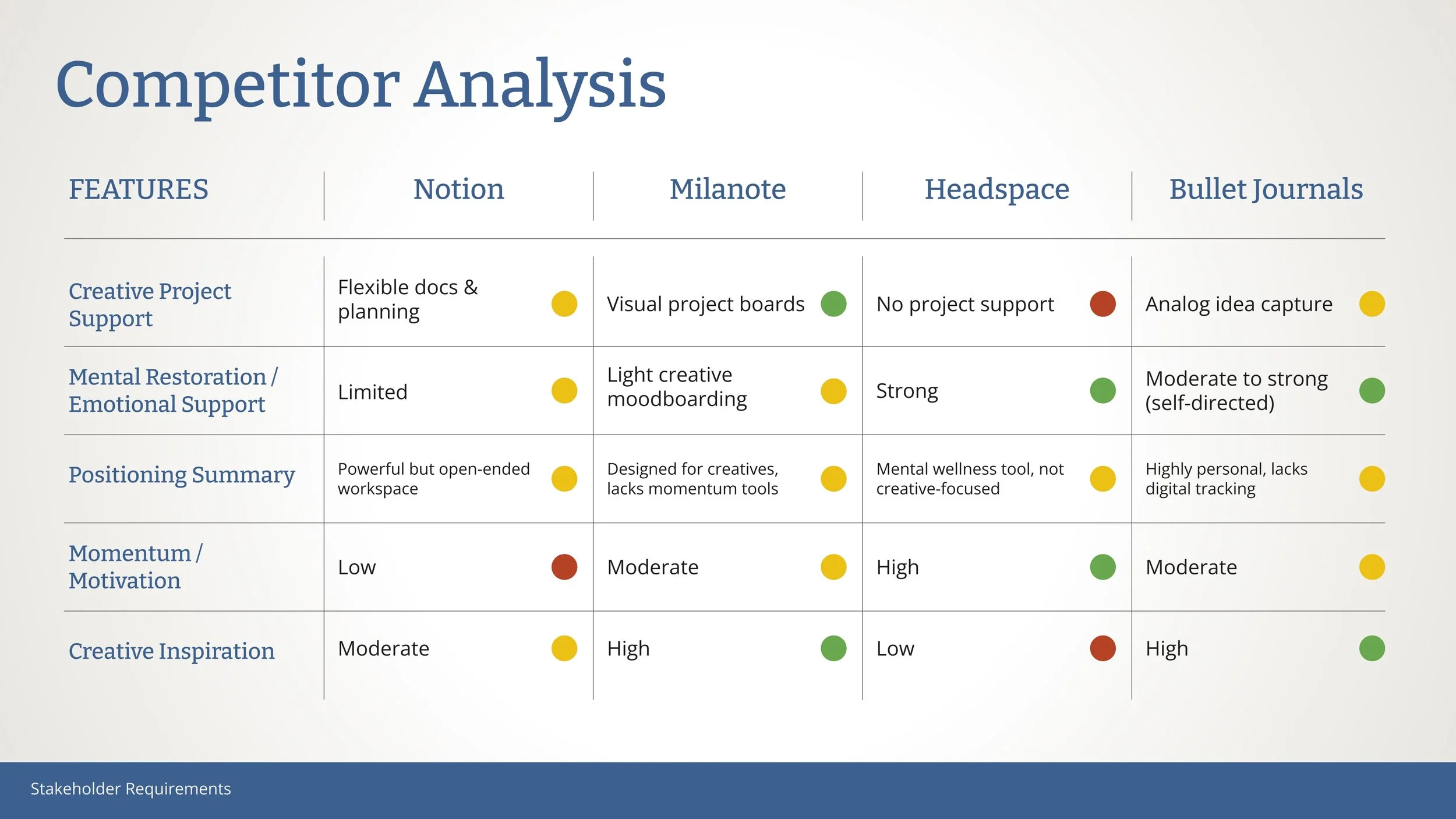
To ensure Creative Calm was not only user-centered but also viable and scalable, I aligned key stakeholder needs with technical feasibility and business goals—balancing emotional impact with practical outcomes. I also conducted a competitor analysis to identify key areas for business success.

Solution Design
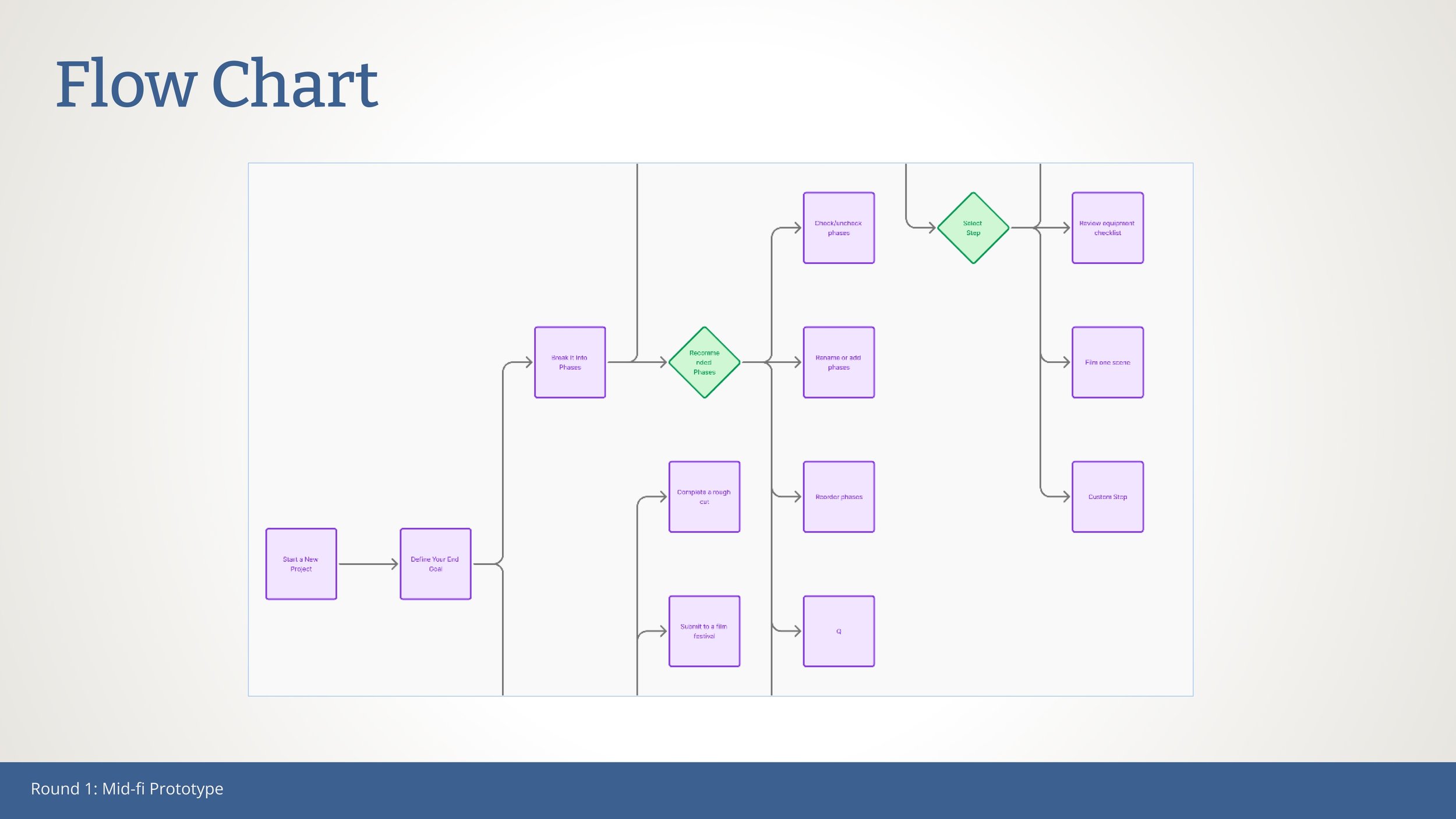
With a clear problem and validated needs, I began translating insights into structure. Starting with a hypothesis, I mapped out possible features in a mind map, explored user journeys through a flow chart, and created early sketches to define the core experience—all foundational steps before building the mid-fi prototype.
Hypothesis
If busy artists and designers struggle to make progress on passion projects due to mental overload and emotional fatigue,
then providing a calming, guided tool that helps them clear mental clutter and break ideas into manageable steps
will increase their ability to re-engage and sustain creative momentum,
because reducing cognitive load and restoring clarity can help them reconnect with their creative energy.


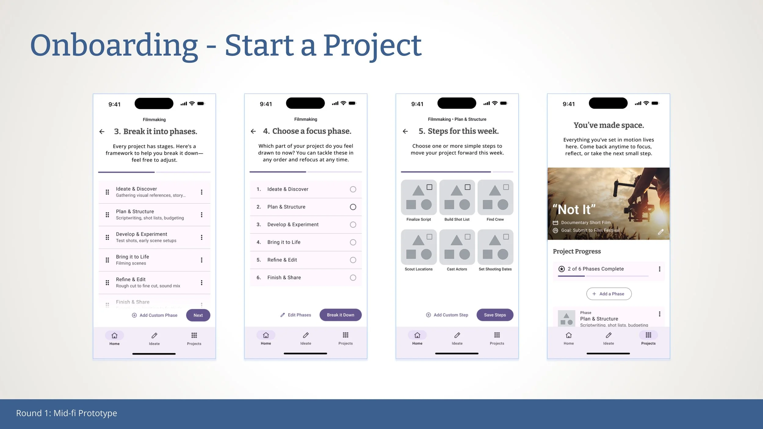
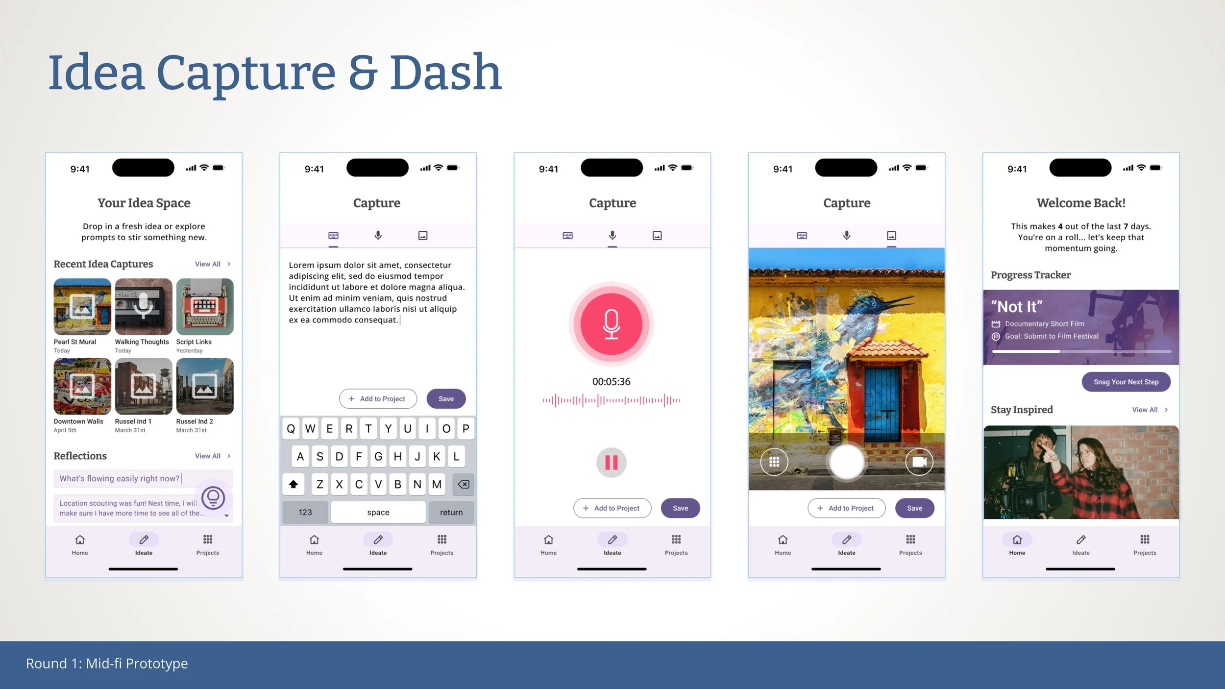
Mid-fi Prototypes
The mid-fi prototype brought early concepts to life, focusing on core features: a calming onboarding flow, project clarity builder, simple task breakdown, and lightweight idea capture. These were designed to reduce mental clutter, support emotional motivation, and make progress feel attainable.

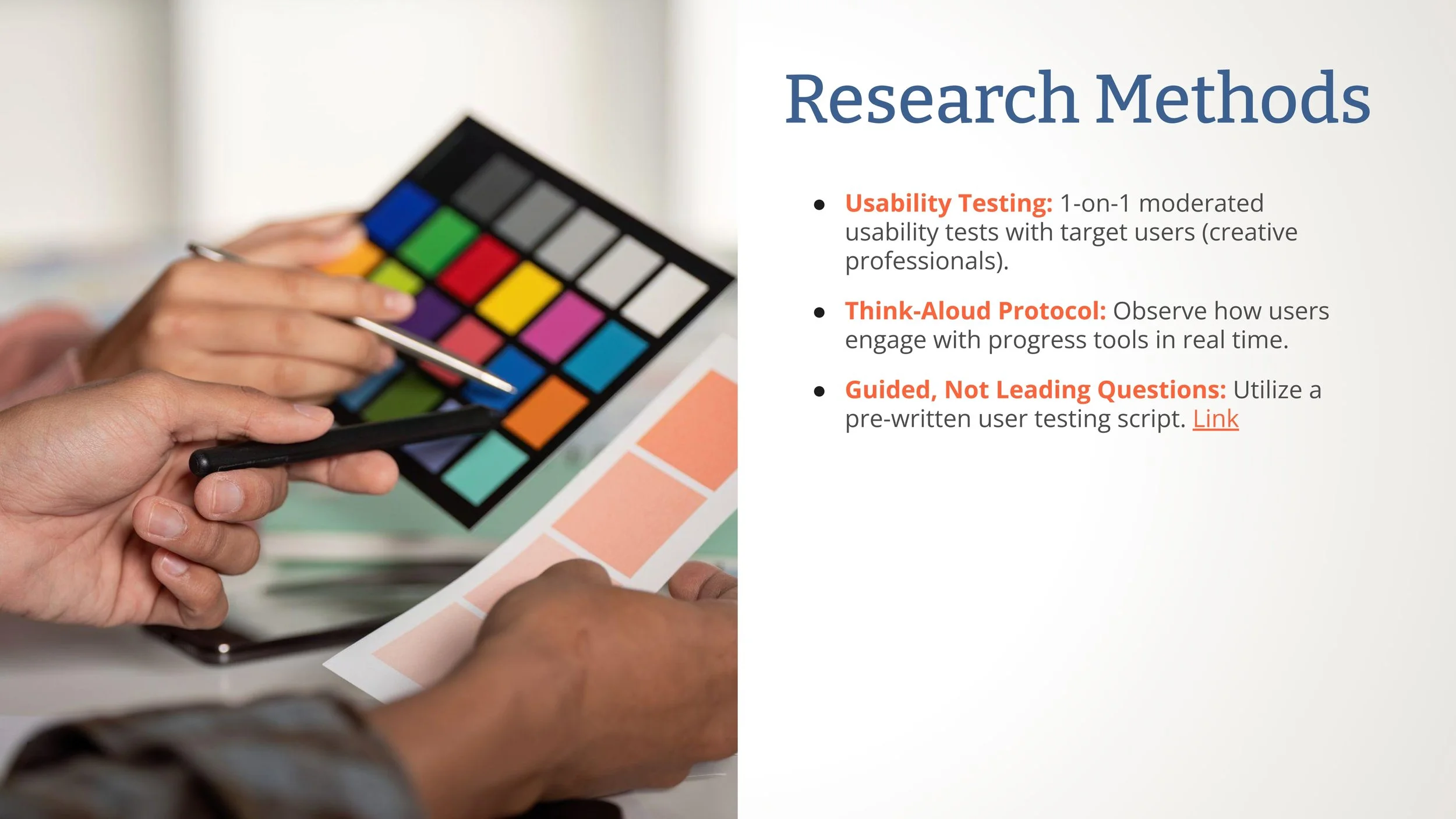
User Testing & Findings
With the mid-fi prototype in hand, I conducted usability testing to understand how real users engaged with the app. The goal was to identify which features supported clarity and motivation, where users felt friction or confusion, and how the emotional tone landed. The feedback offered valuable insights that shaped key design refinements in the next iteration.
Pluses


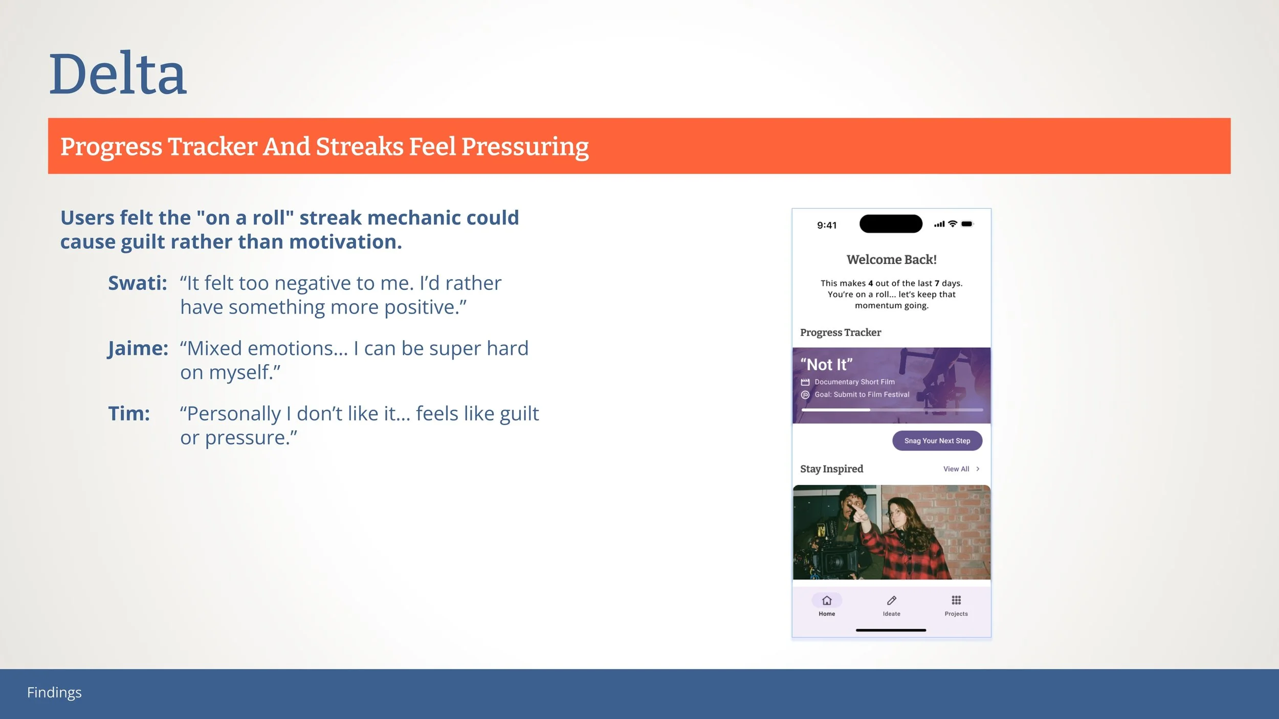
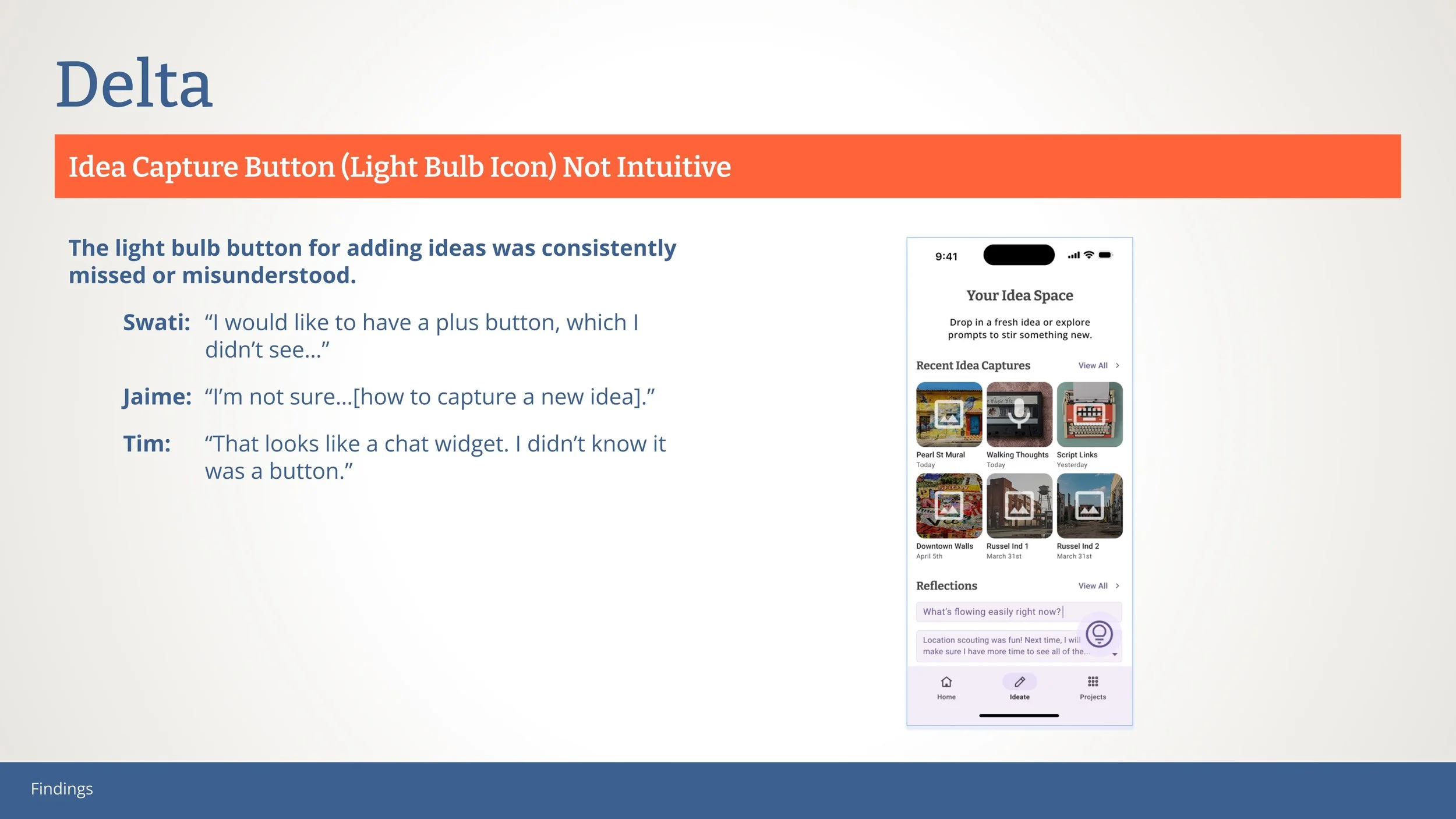
Deltas

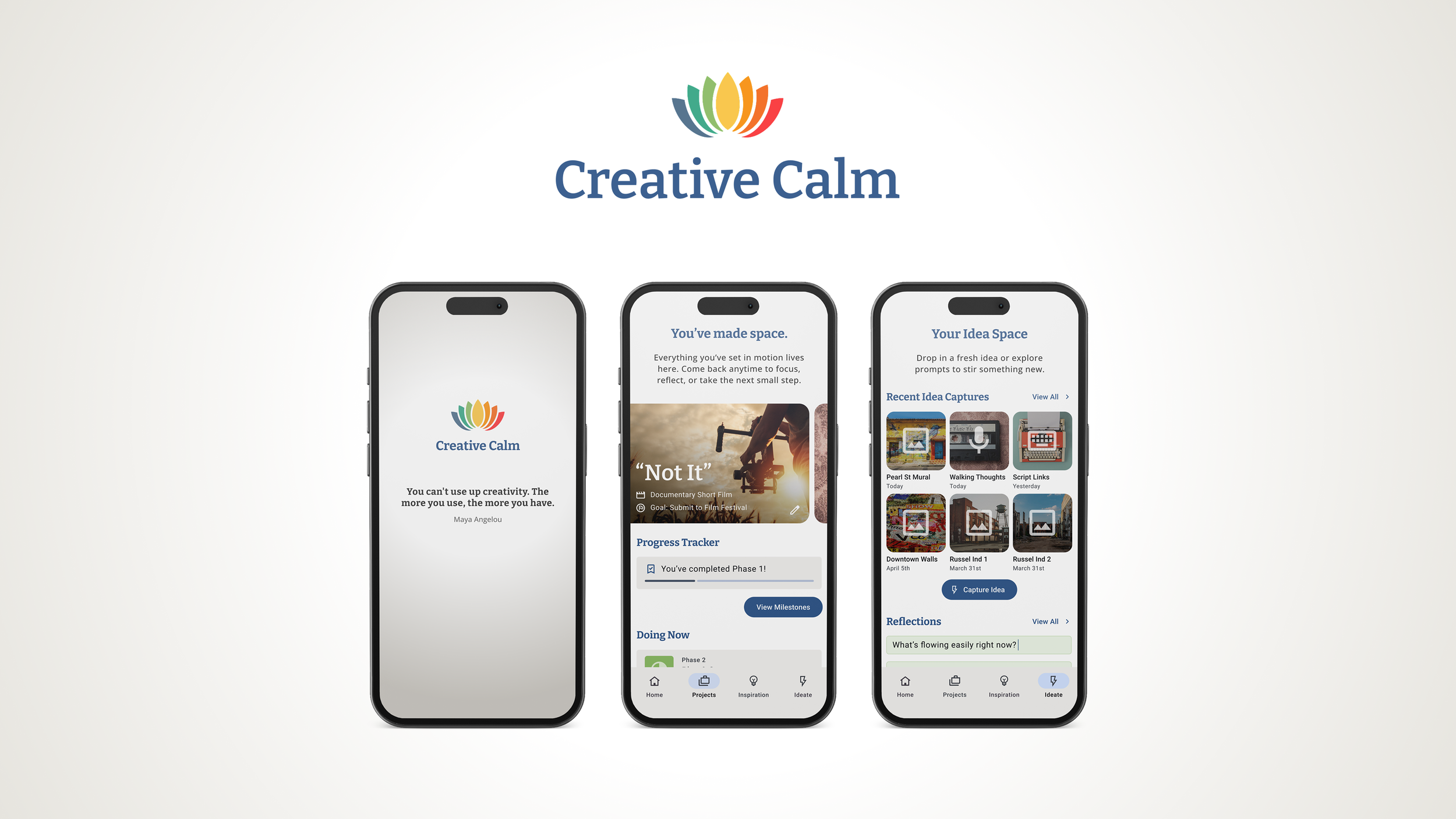
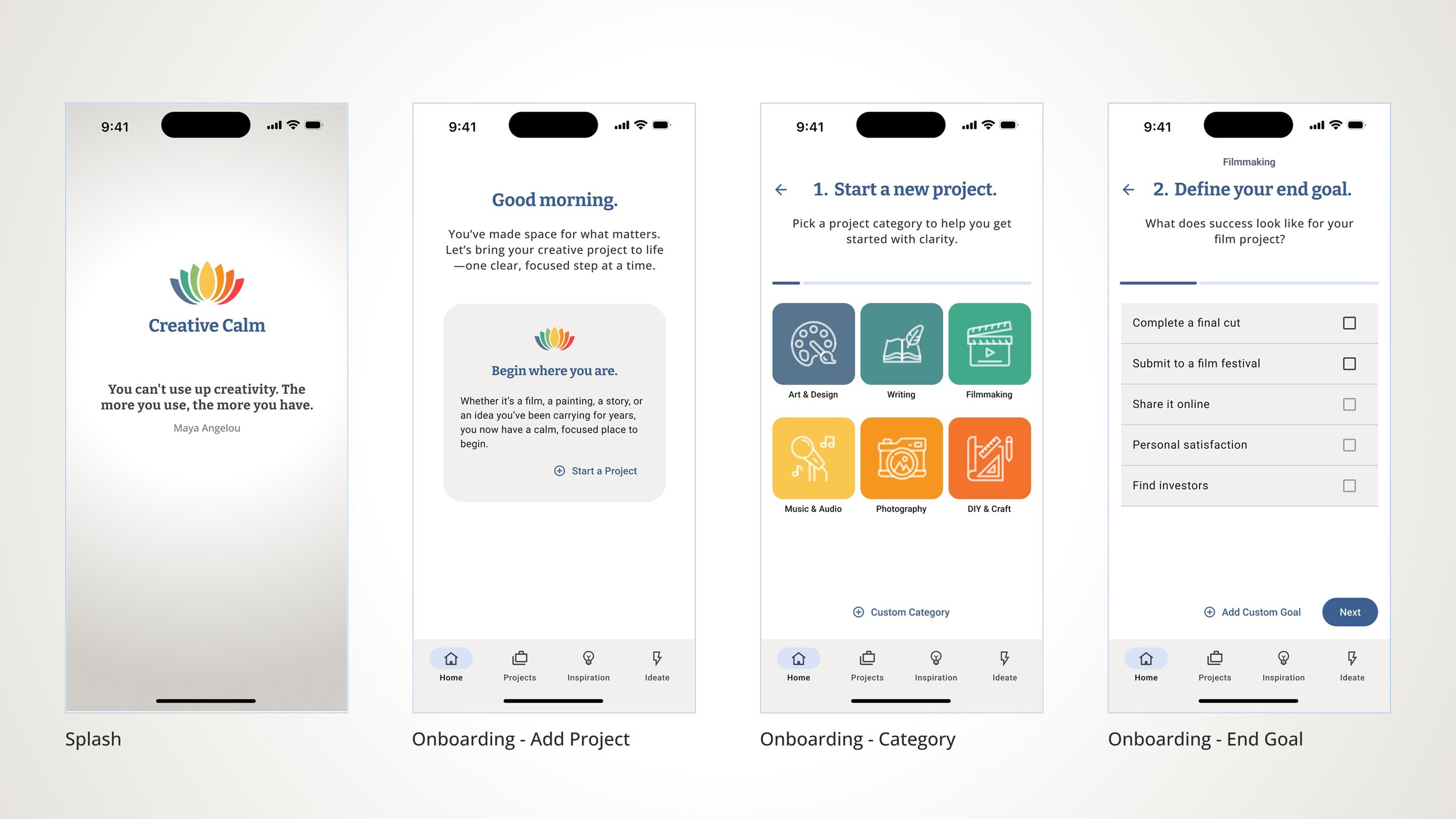
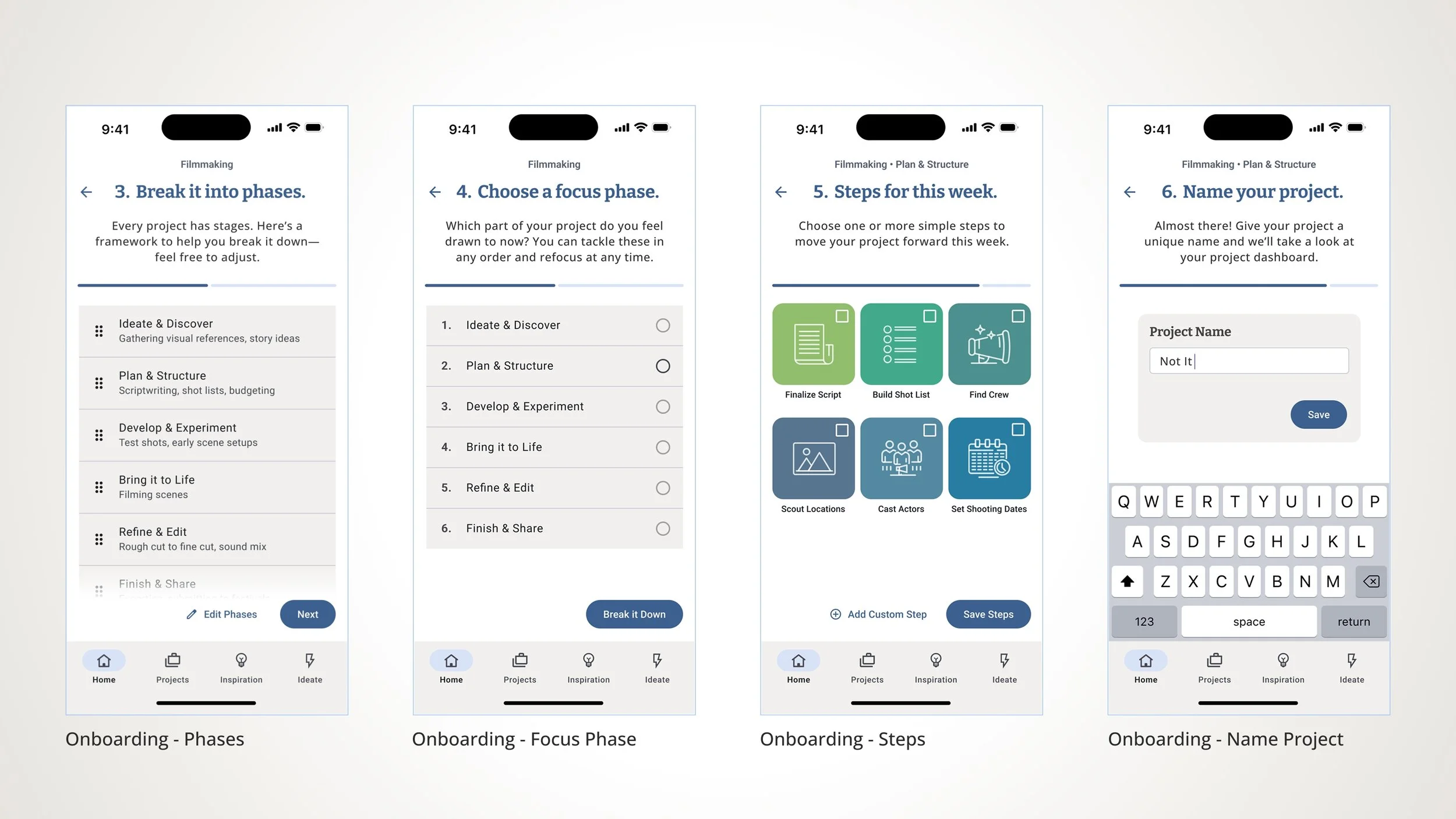
Hi‑Fi Prototype: Polished Experience for Creative Focus
Building on the structural clarity of the mid-fi version, the high-fidelity prototype introduced a refined visual language and streamlined navigation. Key updates included:
Brand Identity: A cohesive logo, calming color palette, and clean typography to reflect the app’s tone.
Navigation Enhancements: “Ideate” was split into two distinct tabs—Inspiration and Ideate—to clarify purpose and ease of use.
Simplified CTAs: Removed overlapping buttons like “Take the Tour” to reduce friction and help users focus.
Progress Language: Replaced pressure-based streak mechanics with affirming, encouraging progress indicators.
Curated Content: Introduced a “Filmmaker Stories” carousel to inspire users based on their project type.
These changes brought the experience closer to the app’s vision: a calm, motivating space for creatives to find clarity and take meaningful steps forward.


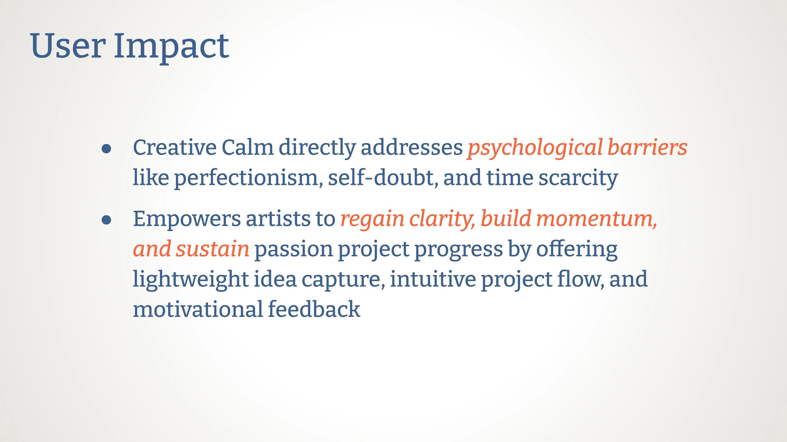
Impact & Learnings
Creative Calm had a meaningful effect on users, helping them reconnect with their creative energy and take focused, manageable steps forward. Along the way, the project revealed key insights about user behavior and emotional design. Here’s what the app achieved and what the process taught me.